


Importimport { Popconfirm } from 'antd'; |
contributors
Importimport { Popconfirm } from 'antd'; |
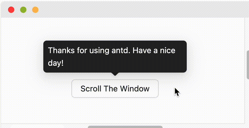
A simple and compact dialog used for asking for user confirmation.
The difference with the confirm modal dialog is that it's more lightweight than the static popped full-screen confirm modal.
Common props ref:Common props
| Property | Description | Type | Default | Version | Global Config |
|---|---|---|---|---|---|
| cancelButtonProps | The cancel button props | ButtonProps | - | × | |
| cancelText | The text of the Cancel button | string | Cancel | × | |
| disabled | Whether show popconfirm when click its childrenNode | boolean | false | × | |
| icon | Customize icon of confirmation | ReactNode | <ExclamationCircleFilled /> | × | |
| okButtonProps | The ok button props | ButtonProps | - | × | |
| okText | The text of the Confirm button | string | OK | × | |
| okType | Button type of the Confirm button | string | primary | × | |
| showCancel | Show cancel button | boolean | true | 4.18.0 | × |
| title | The title of the confirmation box | ReactNode | () => ReactNode | - | × | |
| description | The description of the confirmation box title | ReactNode | () => ReactNode | - | 5.1.0 | × |
| onCancel | A callback of cancel | function(e) | - | × | |
| onConfirm | A callback of confirmation | function(e) | - | × | |
| onPopupClick | A callback of popup click | function(e) | - | 5.5.0 | × |
| Property | Description | Type | Default | Version | Global Config |
|---|---|---|---|---|---|
| align | Please refer to the settings dom-align | object | - | × | |
| arrow | Change arrow's visible state and change whether the arrow is pointed at the center of target. | boolean | { pointAtCenter: boolean } | true | 5.2.0 | Tooltip: 6.0.0, Popover: 6.0.0, Popconfirm: 6.0.0 |
| autoAdjustOverflow | Whether to adjust popup placement automatically when popup is off screen | boolean | true | × | |
| color | The background color | string | - | 4.3.0 | × |
| classNames | Customize class for each semantic structure inside the component. Supports object or function. | Record<SemanticDOM, string> | (info: { props })=> Record<SemanticDOM, string> | - | 5.23.0 | Tooltip: 5.23.0, Popover: 5.23.0, Popconfirm: 5.23.0 |
| defaultOpen | Whether the floating tooltip card is open by default | boolean | false | 4.23.0 | × |
| Whether destroy dom when close | boolean | false | × | ||
| destroyOnHidden | Whether destroy dom when close | boolean | false | 5.25.0 | × |
| fresh | Tooltip will cache content when it is closed by default. Setting this property will always keep updating | boolean | false | 5.10.0 | × |
| getPopupContainer | The DOM container of the tip, the default behavior is to create a div element in body | (triggerNode: HTMLElement) => HTMLElement | () => document.body | × | |
| mouseEnterDelay | Delay in seconds, before tooltip is shown on mouse enter | number | 0.1 | × | |
| mouseLeaveDelay | Delay in seconds, before tooltip is hidden on mouse leave | number | 0.1 | × | |
Class name of the tooltip card, please use classNames.root instead | string | - | × | ||
Style of the tooltip card, please use styles.root | React.CSSProperties | - | × | ||
Style of the tooltip inner content, please use styles.container instead | React.CSSProperties | - | × | ||
| placement | The position of the tooltip relative to the target, which can be one of top left right bottom topLeft topRight bottomLeft bottomRight leftTop leftBottom rightTop rightBottom | string | top | × | |
| styles | Customize inline style for each semantic structure inside the component. Supports object or function. | Record<SemanticDOM, CSSProperties> | (info: { props })=> Record<SemanticDOM, CSSProperties> | - | 5.23.0 | Tooltip: 5.23.0, Popover: 5.23.0, Popconfirm: 5.23.0 |
| trigger | Tooltip trigger mode. Could be multiple by passing an array | hover | focus | click | contextMenu | Array<string> | hover | Tooltip: 6.1.0, Popover: 6.1.0, Popconfirm: 6.1.0 | |
| open | Whether the floating tooltip card is open or not. Use visible under 4.23.0 (why?) | boolean | false | 4.23.0 | × |
| zIndex | Config z-index of Tooltip | number | - | × | |
| onOpenChange | Callback executed when visibility of the tooltip card is changed | (open: boolean) => void | - | 4.23.0 | × |
| Token Name | Description | Type | Default Value |
|---|---|---|---|
| zIndexPopup | z-index of Popconfirm | number | 1060 |
| Token Name | Description | Type | Default Value |
|---|---|---|---|
| colorText | Default text color which comply with W3C standards, and this color is also the darkest neutral color. | string | rgba(0,0,0,0.88) |
| colorTextHeading | Control the font color of heading. | string | rgba(0,0,0,0.88) |
| colorWarning | Used to represent the warning map token, such as Notification, Alert, etc. Alert or Control component(like Input) will use these map tokens. | string | #faad14 |
| fontSize | The most widely used font size in the design system, from which the text gradient will be derived. | number | 14 |
| fontWeightStrong | Control the font weight of heading components (such as h1, h2, h3) or selected item. | number | 600 |
| marginXS | Control the margin of an element, with a small size. | number | 8 |
| marginXXS | Control the margin of an element, with the smallest size. | number | 4 |
findDOMNode is deprecated sometimes appear in strict mode?This is due to the implementation of @rc-component/trigger. @rc-component/trigger forces children to accept ref, otherwise it will fall back to findDOMNode, so children need to be native html tags. If not, you need to use React.forwardRef transparently passes ref to native html tags.
findDOMNode is deprecated reproduce: https://codesandbox.io/p/sandbox/finddomnode-c5hy96forwardRef to fix: https://codesandbox.io/p/sandbox/no-finddomnode-warning-forked-gdxczsSimilar issues: #15909, #12812.
Please ensure that the child node to accept onMouseEnter, onMouseLeave, onPointerEnter, onPointerLeave, onFocus, and onClick events, If you create your own component and do not explicitly add these mouse and pointer events as props, the tooltip will never appear. See Example.
It will follow placement config when screen has enough space. And flip when space is not enough (Such as top to bottom or topLeft to bottomLeft). Single direction such as top bottom left right will auto shift on the view:
When placement is set to edge align such as topLeft bottomRight, it will only do flip but not do shift.
By default, Tooltip and similar components trigger on hover rather than focus, so they will not respond to keyboard focus events. If you want the component to support keyboard accessibility, you can enable it in the following ways:
trigger property to include focus, for example trigger="focus" or trigger={['hover', 'focus']}.ConfigProvider to set global configuration, so all relevant components across your application support keyboard focus trigger by default.import { ConfigProvider, Tooltip, Button } from 'antd';// Single component<Tooltip trigger={['hover', 'focus']} title="Title"><Button>Button</Button></Tooltip>// Global configuration<ConfigProvidertooltip={{ trigger: ['hover', 'focus'] }}popover={{ trigger: ['hover', 'focus'] }}popconfirm={{ trigger: ['hover', 'focus'] }}><App /></ConfigProvider>
For more questions, please refer to Tooltip FAQ.