


2023-10-11
@zombieJ
contributors
You may have received this warning when upgrading Ant Design:
Warning: [antd: XXX] `old prop` is deprecated. Please use `new prop` instead.
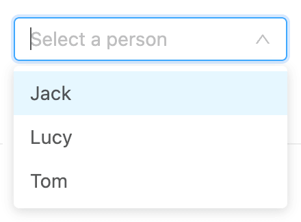
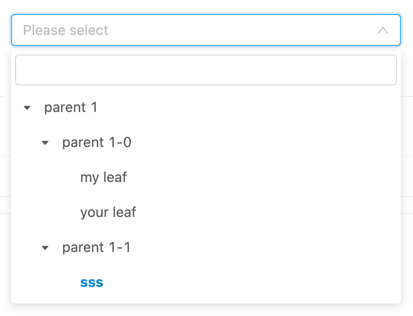
This is because antd has some historical debt in API design. For example, in antd v3 and before, the code of TreeSelect was directly copied from Select and extended on this basis. There are differences in their search styles:
And in the maintenance process, developers want to control the content of the search box. Unfortunately, this requirement was PR by different developers at different times. So two different properties were added, one called inputValue and the other called searchValue:
// Select in combobox mode, the search box is the input box, `inputValue` looks reasonable<Select inputValue="search" />// TreeSelect's search box is in the popup layer, `searchValue` is also reasonable<TreeSelect searchValue="search" />
In multiple mode, the Select component will clear the search box content after selecting the content. But in some scenarios, developers want to keep it. So TreeSelect and Select added the autoClearSearchValue property.
Wait! Select is called inputValue, why should it be called autoClearSearchValue? Obviously it should be called autoClearInputValue. If we continue to grow other similar API styles on the existing API. You will find that the component's props are getting more and more split. This will also cause bad smells in code maintenance. For example, in the above example, we later extracted the Select component into a unified UI layer and merged it into the rc-select component. rc-tree-select only needs to implement the content of the popup layer, and the structure and style of the input box can be completely reused with Select. But because the APIs of the two are inconsistent, we need to do extra processing, so we need to refactor these API debts and unify them during the iteration process. (In v4, we merged it into searchValue and unified the design)
However there is no silver bullet in the world, we can't design a perfect API at the beginning. Some APIs seem very reasonable at the beginning of the design, but as the iteration progresses, they will be found to be more or less inappropriate. For example, the popup layer was named dropdown in the early days, which corresponds to the popup content of Dropdown and Select components. But for Tooltip, dropdown is obviously not suitable. From a unified perspective, popup will be more suitable.
We gradually unified the API naming rules during the maintenance process (API Naming rules). When adding new features, we prefer to find similar APIs from existing ones. For existing APIs, deprecated warnings are gradually added. In order to maintain compatibility, our strategy is that the deprecated warnings provided by each version will continue to be compatible with a major version, and it will be removed in the next major version. For example, in v4, deprecated warnings are added, so they can still be used in v5, but they will be removed in v6. In this way, developers have enough time to migrate.
But from the developer's point of view, this is not reasonable. Developers only upgraded antd, but they have to suffer from the intrusion of console because of the API design mistakes of the component library. If a few usage warnings are mixed into the deprecated warnings, developers often have difficulty finding them. This situation is particularly prominent in major version upgrades. The business may not give you enough time to do the upgrade migration, so you have to use compatible packages and other technical means to make it run first. For long deprecated warnings, developers have to choose to temporarily (or permanently) ignore them. For this situation, usage warnings will be more important, so we propose the Warning Filter RFC.
You can aggregate the deprecated information through the warning property of ConfigProvider:
<ConfigProvider warning={{ strict: false }} />
After aggregation, the original flattened deprecated information will be merged into an array and displayed in the console. And it will not affect the usage warnings:
As mentioned above, there is no silver bullet in API design. In order to prevent breaking change, we generally will not change the existing API implementation. But for some conventions, this will cause trouble. For example, the ref component is a typical convention. As long as it is a React developer, you can understand that you can get the DOM node through ref and do some basic operations such as focus. But for composite components, the calling method and DOM may not be unified. For example, the ref of the Table component should obviously be the outermost div, but the scrollTo method should correspond to the scroll container (if it is VirtualTable, it should be handled by the internal @rc-component/virtual-list). In antd mobile, ref is designed as a composite structure, and the DOM node is always returned through nativeElement:
export interface SampleRef {nativeElement: HTMLElement;focus(): void;blur(): void;}
But in antd, because we did not make a convention for ref early, we encountered difficulties in implementing the method. But fortunately, there is Proxy support, we can intercept ref through Proxy and return the results we want:
useImperativeHandle(ref,() =>new Proxy(divRef.current, {get(target, key) {// ...},}),);
We can continue to be compatible with previous usage in this way. It is still a DOM node, but it also supports the definition call of SampleRef.
API design is a difficult problem. As the iteration of technology stack and components themselves. Some designs will gradually decay, and API upgrades themselves are also painful for developers. We hope that through this article, you can understand our design ideas and some problems in the upgrade process. If you have any suggestions or ideas, welcome to discuss on GitHub.
