
2023-09-03
@zombieJ
Articles are included in the column:

contributors
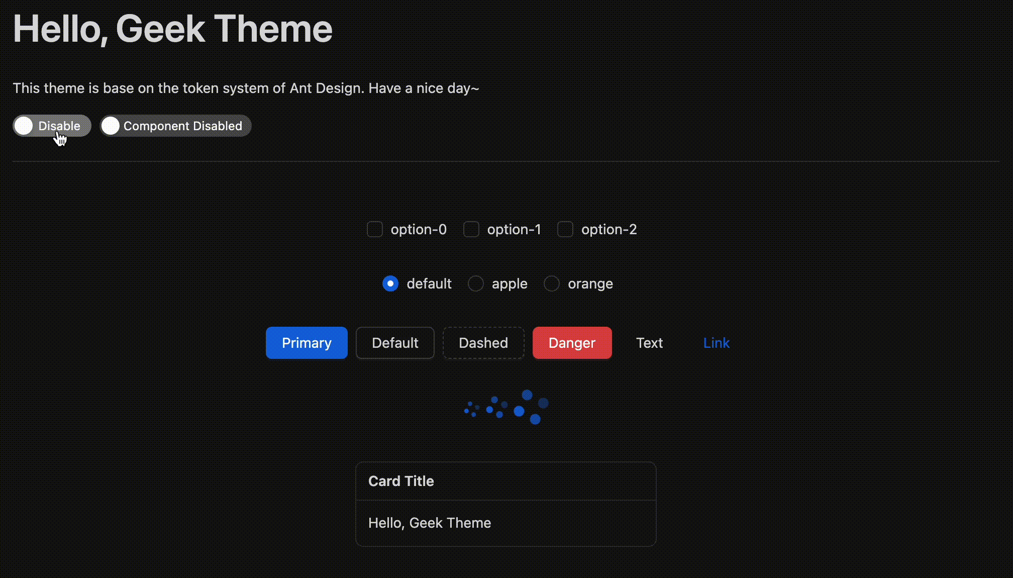
Ant Design v5 provides the Design Token model, which supports custom algorithm to implement theme extension capabilities. For example, the compact theme itself does not carry color style algorithms, so it can be implemented by passing in multiple algorithms to achieve the compact theme under the light theme and the compact theme under the dark theme.
Today, we now put down the algorithm part. Talk about how to extend the theme through ConfigProvider.
This is an example of using ConfigProvider to extend the theme. You can view the complete code directly here (online demo):
We will talk about how to use ConfigProvider to extend the theme in Ant Design. Of course, this article is not a CSS tutorial, so we will not introduce the style implementation above. If you are interested, you can directly look at the code instead.
Design Token has powerful extension capabilities, but it also has limitations. For example, when Token does not support some configurations, developers become powerless. Even worse, some theme implementations cannot rely solely on a certain Token, which will become very difficult. For example, the gradient border colors in the above example cannot be implemented simply by border-color, it requires some CSS tricks. As mentioned in "Happy Work Theme", landing some specific implementations to Design Token will cause the code quality to deteriorate rapidly. Therefore, we need some other ways to extend the theme, which can uniformly modify the style of a component. And ConfigProvider is such an entry.
In 5.7.0, ConfigProvider supports the className and style configurations of all components. So we can easily extend beyond Token:
<ConfigProviderbutton={{ className: 'my-button' }}checkbox={{ className: 'my-checkbox' }}divider={{ className: 'my-divider' }}/>
And then we can go to add our style:
.my-button {background: red;}
This is actually strange. Since we can modify the style through className, why do we need ConfigProvider? We can just override the .ant-btn style.
If your project is maintained by only one person, this is a good idea. But if your project is a large project, then you will find that this approach will cause style conflicts. Especially in the case of multi-person collaboration, modifying styles at will will result in unexpected results, and other people have to use more complex selectors to override your styles. ConfigProvider can solve this problem well. It can isolate styles inside ConfigProvider and will not affect other components.
Above example looks easy to implement, but in real scenarios you will find that there are some shortcomings for hierarchical structures. For example, the ant- prefix can be modified by ConfigProvider's prefixCls, so the prefix of the semantic structure may change from ant-btn-icon to abc-btn-icon. So it is not enough to override only by my-button:
.my-button {// OPS. It's `abc-btn-icon` now..ant-btn-icon {background: red;}}
So our extended theme also needs the ability to consume prefixCls. In CSS-in-JS, mixing prefixCls is easy. We can get prefixCls through the getPrefixCls method of ConfigProvider, and then mix it:
// This is an example of using `antd-style`, you can use any CSS-in-JS library.import React from 'react';import { ConfigProvider } from 'antd';import { createStyles } from 'antd-style';const useButtonStyle = createStyles(({ css }, prefixCls: string) => {return {btn: css`background: red;.${prefixCls}-icon {color: green;}`,};});const GeekProvider: React.FC<Readonly<React.PropsWithChildren>> = (props) => {const { getPrefixCls } = React.useContext(ConfigProvider.ConfigContext);const btnPrefixCls = getPrefixCls('btn');const { styles } = useButtonStyle(btnPrefixCls);return <ConfigProvider button={{ className: styles.btn }}>{props.children}</ConfigProvider>;};export default GeekProvider;
It's also easy to extend for scenarios that need to inherit className:
import React from 'react';import { ConfigProvider } from 'antd';import { clsx } from 'clsx';const GeekProvider: React.FC<Readonly<React.PropsWithChildren>> = (props) => {const { button, getPrefixCls } = React.useContext(ConfigProvider.ConfigContext);const btnPrefixCls = getPrefixCls('btn');const { styles } = useButtonStyle(btnPrefixCls);return (<ConfigProvider button={{ className: clsx(button?.className, styles.btn) }}>{props.children}</ConfigProvider>);};export default GeekProvider;
Through ConfigProvider, we can further extend the theme. It can isolate styles well and avoid style conflicts. Let's try it out!