


Tooltip文字提示
Tooltip
文字提示
使用import { Tooltip } from 'antd'; |
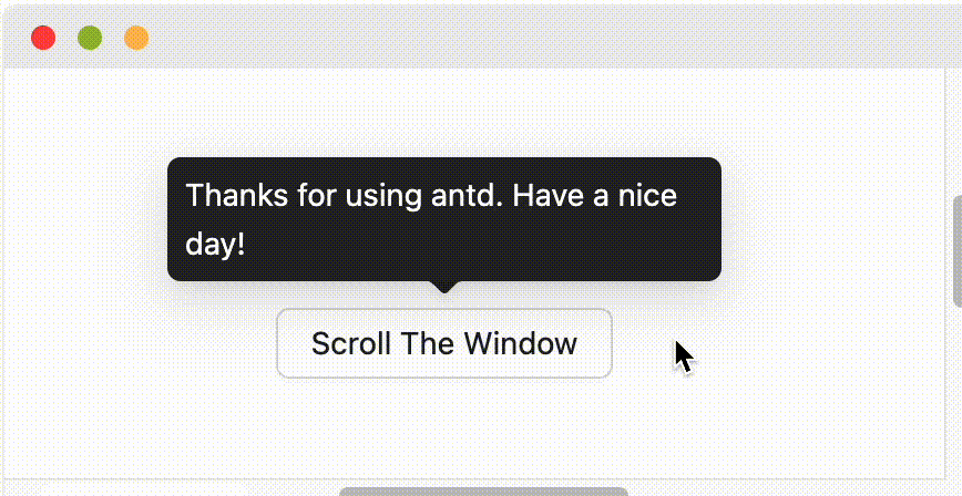
鼠标移入则显示提示,移出消失,气泡浮层不承载复杂文本和操作。
可用来代替系统默认的 title 提示,提供一个 按钮/文字/操作 的文案解释。
通用属性参考:通用属性
| 参数 | 说明 | 类型 | 默认值 | 版本 | 全局配置 |
|---|---|---|---|---|---|
| title | 提示文字 | ReactNode | () => ReactNode | - | - | × |
| color | 设置背景颜色,使用该属性后内部文字颜色将自适应 | string | - | 5.27.0 | × |
| classNames | 语义化结构 class | Record<SemanticDOM, string> | (info: { props }) => Record<SemanticDOM, string> | - | 5.23.0 | 5.23.0 |
| styles | 语义化结构 style | Record<SemanticDOM, CSSProperties> | (info: { props }) => Record<SemanticDOM, CSSProperties> | - | 5.23.0 | 5.23.0 |
| 参数 | 说明 | 类型 | 默认值 | 版本 | 全局配置 |
|---|---|---|---|---|---|
| align | 请参考 dom-align 进行配置 | object | - | × | |
| arrow | 修改箭头的显示状态以及修改箭头是否指向目标元素中心 | boolean | { pointAtCenter: boolean } | true | 5.2.0 | Tooltip: 6.0.0,Popover: 6.0.0,Popconfirm: 6.0.0 |
| autoAdjustOverflow | 气泡被遮挡时自动调整位置 | boolean | true | × | |
| color | 背景颜色 | string | - | 4.3.0 | × |
| classNames | 用于自定义组件内部各语义化结构的 class,支持对象或函数 | Record<SemanticDOM, string> | (info: { props }) => Record<SemanticDOM, string> | - | 5.23.0 | Tooltip: 5.23.0,Popover: 5.23.0,Popconfirm: 5.23.0 |
| defaultOpen | 默认是否显隐 | boolean | false | 4.23.0 | × |
| 关闭后是否销毁 dom | boolean | false | × | ||
| destroyOnHidden | 关闭后是否销毁 dom | boolean | false | 5.25.0 | × |
| fresh | 默认情况下,Tooltip 在关闭时会缓存内容。设置该属性后会始终保持更新 | boolean | false | 5.10.0 | × |
| getPopupContainer | 浮层渲染父节点,默认渲染到 body 上 | (triggerNode: HTMLElement) => HTMLElement | () => document.body | × | |
| mouseEnterDelay | 鼠标移入后延时多少才显示 Tooltip,单位:秒 | number | 0.1 | × | |
| mouseLeaveDelay | 鼠标移出后延时多少才隐藏 Tooltip,单位:秒 | number | 0.1 | × | |
卡片类名, 请使用 classNames.root 替换 | string | - | × | ||
卡片样式, 请使用 styles.root 替换 | React.CSSProperties | - | × | ||
卡片内容区域的样式对象, 请使用 styles.container 替换 | React.CSSProperties | - | × | ||
| placement | 气泡框位置,可选 top left right bottom topLeft topRight bottomLeft bottomRight leftTop leftBottom rightTop rightBottom | string | top | × | |
| styles | 用于自定义组件内部各语义化结构的行内 style,支持对象或函数 | Record<SemanticDOM, CSSProperties> | (info: { props }) => Record<SemanticDOM, CSSProperties> | - | 5.23.0 | Tooltip: 5.23.0,Popover: 5.23.0,Popconfirm: 5.23.0 |
| trigger | 触发行为,可选 hover | focus | click | contextMenu,可使用数组设置多个触发行为 | string | string[] | hover | Tooltip: 6.1.0,Popover: 6.1.0,Popconfirm: 6.1.0 | |
| open | 用于手动控制浮层显隐,小于 4.23.0 使用 visible(为什么?) | boolean | false | 4.23.0 | × |
| zIndex | 设置 Tooltip 的 z-index | number | - | × | |
| onOpenChange | 显示隐藏的回调 | (open: boolean) => void | - | 4.23.0 | × |
可以通过 ConfigProvider 全局配置 Tooltip 的唯一性显示。当 unique 设置为 true 时,同一时间 ConfigProvider 下的 Tooltip 只会显示一个,提供更好的用户体验和平滑的过渡效果。
注意:配置后 getContainer、arrow 等属性将会失效。
import { Button, ConfigProvider, Space, Tooltip } from 'antd';export default () => (<ConfigProvidertooltip={{unique: true,}}><Space><Tooltip title="第一个提示"><Button>按钮 1</Button></Tooltip><Tooltip title="第二个提示"><Button>按钮 2</Button></Tooltip></Space></ConfigProvider>);
| Token 名称 | 描述 | 类型 | 默认值 |
|---|---|---|---|
| maxWidth | 文字提示最大宽度 | number | 250 |
| zIndexPopup | 文字提示 z-index | number | 1070 |
| Token 名称 | 描述 | 类型 | 默认值 |
|---|---|---|---|
| colorBgSpotlight | 该色用于引起用户强烈关注注意的背景色,目前只用在 Tooltip 的背景色上。 | string | rgba(0,0,0,0.85) |
| colorText | 最深的文本色。为了符合W3C标准,默认的文本颜色使用了该色,同时这个颜色也是最深的中性色。 | string | rgba(0,0,0,0.88) |
| colorTextLightSolid | 控制带背景色的文本,例如 Primary Button 组件中的文本高亮颜色。 | string | #fff |
| borderRadius | 基础组件的圆角大小,例如按钮、输入框、卡片等 | number | 6 |
| borderRadiusXS | XS号圆角,用于组件中的一些小圆角,如 Segmented 、Arrow 等一些内部圆角的组件样式中。 | number | 2 |
| controlHeight | Ant Design 中按钮和输入框等基础控件的高度 | number | 32 |
| fontFamily | Ant Design 的字体家族中优先使用系统默认的界面字体,同时提供了一套利于屏显的备用字体库,来维护在不同平台以及浏览器的显示下,字体始终保持良好的易读性和可读性,体现了友好、稳定和专业的特性。 | string | -apple-system, BlinkMacSystemFont, 'Segoe UI', Roboto, 'Helvetica Neue', Arial, 'Noto Sans', sans-serif, 'Apple Color Emoji', 'Segoe UI Emoji', 'Segoe UI Symbol', 'Noto Color Emoji' |
| fontSize | 设计系统中使用最广泛的字体大小,文本梯度也将基于该字号进行派生。 | number | 14 |
| lineHeight | 文本行高 | number | 1.5714285714285714 |
| motionDurationFast | 动效播放速度,快速。用于小型元素动画交互 | string | 0.1s |
| motionDurationMid | 动效播放速度,中速。用于中型元素动画交互 | string | 0.2s |
| motionDurationSlow | 动效播放速度,慢速。用于大型元素如面板动画交互 | string | 0.3s |
| motionEaseInOutCirc | 预设动效曲率 | string | |
| motionEaseOutCirc | 预设动效曲率 | string | |
| paddingSM | 控制元素的小内间距。 | number | 12 |
| paddingXS | 控制元素的特小内间距。 | number | 8 |
| sizePopupArrow | 组件箭头的尺寸 | number | 16 |
请确保 Tooltip 的子元素能接受 onMouseEnter、onMouseLeave、onPointerEnter、onPointerLeave、onFocus、onClick 事件。
请查看 https://github.com/ant-design/ant-design/issues/15909
Tooltip 默认在关闭时会缓存内容,以防止内容更新时出现闪烁:
// `title` 不会因为 `user` 置空而闪烁置空<Tooltip open={user} title={user?.name} />

如果需要在关闭时也更新内容,可以设置 fresh 属性(例如 #44830 中的场景):
<Tooltip open={user} title={user?.name} fresh />
findDOMNode is deprecated 这个警告?这是由于 @rc-component/trigger 的实现方式导致的,@rc-component/trigger 强制要求 children 能够接受 ref,否则就会 fallback 到 findDOMNode,所以 children 需要是原生 html 标签,如果不是,则需要使用 React.forwardRef 把 ref 透传到原生 html 标签。
findDOMNode is deprecated 重现:https://codesandbox.io/p/sandbox/finddomnode-c5hy96forwardRef 消除警告:https://codesandbox.io/p/sandbox/no-finddomnode-warning-forked-gdxczs请确保子元素能接受 onMouseEnter、onMouseLeave、onPointerEnter、onPointerLeave、onFocus、onClick 事件。参考示例
当屏幕空间足够时,会按照 placement 的设置进行弹层。当空间不足时则会取反向位置进行弹层(例如 top 不够时,会改为 bottom,topLeft 不够时会改为 bottomLeft)。单一方向如 top bottom left right 当贴边时进行自动位移:
当设置为边缘对齐方向如 topLeft bottomRight 等,则会仅做翻转而不做位移。
Tooltip 等组件的默认触发方式(trigger)为 hover,不包含 focus,因此无法响应键盘聚焦事件。如果你希望组件支持键盘操作,可以通过以下方式开启:
trigger 属性设置为包含 focus 的值,例如 trigger="focus" 或 trigger={['hover', 'focus']}。ConfigProvider 进行全局配置,这样应用内的所有相关组件都会默认支持键盘聚焦触发。import { ConfigProvider, Tooltip, Button } from 'antd';// 单个组件<Tooltip trigger={['hover', 'focus']} title="Title"><Button>Button</Button></Tooltip>// 全局配置<ConfigProvidertooltip={{ trigger: ['hover', 'focus'] }}popover={{ trigger: ['hover', 'focus'] }}popconfirm={{ trigger: ['hover', 'focus'] }}><App /></ConfigProvider>